
Have you ever tried to draw CP's multimark, or apply it to a model? Is it just a curved line and a triangle within? Nope, though it certainly looks good facing various directions! Chairman N.R. 'Buck' Crump and President Ian D. 'Big Julie' Sinclair (below) conducted the debut of this curvilinear creation of Lippincott and Margulies while D.B. Wallace, CP's general manager of public relations and advertising reported directly to them on its application. A portion of a square = stability, a segment of a circle = global activies, a triangle = motion and movement. Gradually applied to train order forms, matchbooks, soap, airplanes, timetables, ships, notepads and all manner of items that could displaya logo:


Strangely and inexplicably, the multimark publicity models included a red tank car and black locomotive. All other publicity models' colours were later painted the same on the prototype... black for hopper cars, green for newsprint cars, aluminum for temperature controlled cars, yellow for insulated/heated cars and vans. The display train that toured Canada (behind C-424's 4239-4242, green newsprint box 81030, mechanical reefer 286138, red 40-foot box 56767, cylindrical hopper 382632, yellow insulated box 165140, 50-foot combination-door box 202199, red mill gondola 342846, flat car and caboose 438850) famously photographed for postcards and lunch boxes in iconic CP locales such as the Laurentians, Lake Superior and the Spiral Tunnels) appeared in Canadian Pacific's 1968 Annual Report, with an MLW blurred locomotive with multimark similar to Michael Berry's photo (top - CP 4563 at the Canadian Railway Museum in St Constant QC).
 There are a couple of exceptions to the usual application of the multimark as seen on a Microscale Decals HO sheet (above), on rolling stock. CP's forty-foot double-door 'exceeds Plate F' appliance boxcars are one (check out Chris van der Heide's model in progress)...


and CP's riveted, centre-cupola cabooses, such as CP 434102 at Winnipeg (Paul B.Smith photo) are another:

The former had a soaring vertical space to fill, and the latter had a window placement issue. (No-one wants to see a munched-out multimark!) CP's fifty-foot insulated, excess-height 167500-series boxcars had a multimark that didn't go all the way to the top.
I believe CP bastardized their own original CP Rail paint scheme by removing the oh-so-expensive-to-apply multimark, beginning with SD40 5513 in 1987. When the even-more-expensive-to-apply and shorter-lived 'Golden Rodent' scheme was unveiled after much secrecy i.e. some units being released without it applied, beginning with AC4400CW 9581 in 1997, the locomotive number font was retained but a new one was introduced for the 'Canadian Pacific' and 'C:P' on the nose. CP 5617 'glistening rodent' trails two SD's in the also short-lived Dual Flags scheme at Trenton, Ontario in August 1999:
 VIA's reversible logo chased the multimark off the letterband of CP's stainless steel equipment, just as the multimark had scared away the beaver a decade earlier, leaving the cars pockmarked and bullet-holed where the beaver-on-shield once proudly posed.

CP's car painters had multimark stencils available for each car type. CP's smallest multimark was likely the one applied to the letter-band of their passenger cars. Flat cars? Forget about it, no room!
Running extra...
Wonder what a multimark would have looked like on a plow wing. Here's a surplus 1926-built plow that CP is offering for sale in Kief, ND. It makes me feel very, very comfortable with my HO scale decalling efforts:
 You have just celebrated a milestone, having read Trackside Treasure's 250th post. No special celebrations planned, just a prolonged release of air as I slump down, suspiring in my easy chair to contemplate the havoc I've wreaked in cyberspace so far. Vampirestat, bloglovin (whatever they are, but I wish they could turn their evil into good - my blog visit numbers are now completely meaningless), spammers "This is a really good post. You have raised some good ideas. I have some ideas I'd like to share on Singapore Apartment Furniture, click here" and Google images (actually useful) have found me.
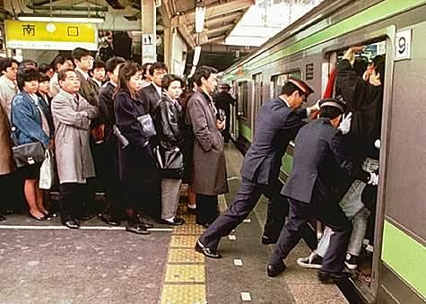
Suddenly sentimental, I saw a romantic news story tonight on a young Japanese couple who held their wedding ceremony in the very same subway car in which they first met. Do you think I could find it on Youtube? Nope. Instead, I offer a photo, also from Japan, that's representative of how I cram even more content into each Trackside Treasure post:

Running extra...
Wonder what a multimark would have looked like on a plow wing. Here's a surplus 1926-built plow that CP is offering for sale in Kief, ND. It makes me feel very, very comfortable with my HO scale decalling efforts:

Suddenly sentimental, I saw a romantic news story tonight on a young Japanese couple who held their wedding ceremony in the very same subway car in which they first met. Do you think I could find it on Youtube? Nope. Instead, I offer a photo, also from Japan, that's representative of how I cram even more content into each Trackside Treasure post:
Arigatou for joining me on the ride so far!
Ride on happy Japanese couple in your subway of blissful happiness, wherever you are!
-Eric
16 comments:
I remember the early multimarks at the rear of engines and how they would be painted over the rear vents on the locomotives. Essentially, the logo went from top to bottom. I wonder when the decision was made to reduce the size of the multimark and fit it beneath the rear vents.
Hi Michael,
I believe it was around 1979 for the first application of the small multimark. A small multimark was better than no multimark at all - that was just an expanse of red paint!
Thanks for your comment,
Eric
With respect to the CP Multimark, the folks at the Ogden Shops can be credited for the first creation of the smaller multimark. They didn't want to paint over grilles and so forth, so just shortened the MM to the body that would support an easier masking job.
Apparently it went unnoticed for a while until the CP brass from Montreal saw it and from what I understand, they were.... shall we say displeased with the change. But when they went back and saw the numbers, apparently they decided that it wasn't so bad after all and thus why we see small Multimarks on a lot of locomotives. It wasn't until late 1987 that the Multimark was given the official heave-ho and you saw no Multimarks or black stripes on the locomotive ends.
So except for the Ogden oddballs, you had a Full Multimark and 5" striping applied across the entire face of the locomotive, then the small multimark with the 8" stripes on just the nose, then no multimark and 8" stripes on the nose and red/white rear, until the Candy Apple Red Dual Flags scheme appeared...
Great to have you aboard, Jon. Thanks for the synopsis on the locomotive schemes.
It's interesting that many associate the multimark with its application to locomotives, which was not without its challenges and changes. At the same time, I'm sure that the application to the myriad surfaces of various modes of the CP transportation network presented its own challenges as well. And I think that's what makes the multimark special.
When it disappeared from locomotives, it signalled another change in CP's focus.
Eric
Interesting blog post. I always thought the distorted airplane tail multimark looked kind of mis-proportioned, but perhaps there was no way around it.
Thanks, Drew. Comparing the slab side of a boxcar to the raked, vertical tail of a jetliner - indeed little room to manoeuvre the multimark.
Now, about that lunchbox...
Eric
Well, call me square but, for me, the Canadian Pacific Script is still the classic. The (hushed whisper) pac man was a sad case of artistic design colliding head on with the perceptions of average folks. So be it. Love the blog - keep it up Eric.
Thanks for your kind comments, William.
I'm not a script hater. It's just that it was (almost imperceptibly quiet whisper) it was a little before my time. There were also some interesting variations of script placement on some CP cars - former passenger cars in MoW Service come to mind.
Great to have you aboard,
Eric
Hi Eric,
Well.... (barely audible whisper requiring hearing assistance - touche` sir, touche`). I do have an observation re 1960's grain collection. Apparently single sheathed boxcars were used for grain collection until 1964 and the rebuilt into "grain hoppers" (perhaps unloading hatches in the floor?) and used until 1983. I can't however find any description or photographs of what these rebuilt cars looked like. There is some reference to grain unloading doors in the floor?
What I have that is concrete is that series 230000 - 233499 was rebuilt into series 234000 - 238999 at which point they are described as "grain hoppers". It's a mystery to me. Run with it if you like and if not (I know you are a busy guy judging by your phenomenal output on Trackside Treasures) maybe someone else might have an answer or an explanation.
Never too busy to learn more, William. Here's what I found:
From BigBlueTrains...I did a little research on the CPR cars, and many, if not all of the 3,500 cars of this type were originally built with Burnett hoppers in the floors, to facilitate the unloading of bulk commodities, such as grain or coal. When not in use, there were fold-down covers, which made the floor of these cars like any other boxcar. In the 1930s, CP began to remove the hoppers and re-numbered those cars into the 234000-238999 series. At the same time those cars received AB brakes and Ajax "power" hand brakes, like the type shown below. The "power" referred to the gears within the brakewheel housing, which offered a mechanical advantage over the vertical-staff type.
I'm sure these cars would have still required lots of shovelling, but before the advent of hydraulic 'car-tippers' at terminal elevators, such devices would likely have saved some labour.
By most accounts, while some of these cars were still in service up to 1983 (according to Ian Cranstone's CPR rolling stock roster) I was railfanning in Manitoba in the 70s and 80s and did not see anything older than a 'minibox' in grain service.
Thanks very much for your comments and questions. I'll keep up my (what I consider) conservative once-a-week blogging schedule and hope you enjoy what I churn out!
Oh, and some interior photos here:
http://mrrminutiae.blogspot.ca/2013/03/grain-car-photos-1903.html
Hope this helps,
Eric
My thanks Eric for the effort and information, much appreciated. The interior photos are gems. You mentioned that in your rail fanning travel you never saw any of these rebuilt cars. In my comment I said these cars were single sheathed, but I may have misused the term. They look like an old school OSB boxcar prior to renumbering. My question is - was anything done to alter the exterior appearance of the cars or did they continue in their renumbered service still looking like OSB cars?
My guess is that the modifications to the floor left the sides much the same. But that is only a guess.
Eric
Were the stripes at 45 degrees to the horizontal, or 40 like the multimark?
Great question, Jamie. CP paint diagrams show the stripes at 45 degrees.
Eric
Congratulations on 250 posts. The multimark may not have achieved the fame of CN's logo, but it sure stood out from the crowd at a distance.
True, Eric. Perhaps if CP had kept its logo more unchanged and consistent, as CN has, it would have had better recognition therefore fame.
We're now actually closing in on 700 posts!
Thanks for being along for the ride!
Eric
Post a Comment