Brooks Stover, a talented modeller of the Buffalo Creek & Gauley in S scale, authored a very useful article published in the January 2021 issue of Model Railroader magazine. Entitled 'Creating Better Layout Photos - Suggestions for improving photographs of model railroads', Brooks illustrated his points with...photographs! I selected eight of his many excellent points to evaluate my own layout photography, recently made more enjoyable with an iPhone. Following these eight points, I'll include and discuss some of my photography of my HO scale Kingston's Hanley Spur, incorporating Brooks' sound advice:
1. Good modelling. The foundation of good layout photos is, of course, good modelling. The camera will exaggerate, not hide imperfections. Structures need solid joints, and rolling stock must be well painted. Scenery must be complete.
2. Generous, uniform lighting. No matter how good the modelling, if a scene doesn't have proper lighting it will be difficult to get a good photo. It may be necessary to bounce some light into shadowed areas, or bring out some shadow detail with photo software.
3. Well-composed scene. The primary objective is to capture viewers' attention, draw them into the scene, and hold their attention.
4. What's in the picture? Avoid including elements that don't reinforce the main story. A common error is placing the main subject too far away and trying to include too much. Eliminate distracting elements in the background like walls and ceilings. Make sure the foreground is in focus and that no part of the layout fascia appears in the image.
5. Believable point of view. For obvious easons, layout photos look the most realistic when taken from near eye level.
6. Sense of life. One way to bring life to a photo is to include human figures. The viewer of the photo will look where the figures are looking, creating eye movement.
7. Lines, shapes, colour and balance. Offsetting the main subject vertically, horizontally, or both, creates more visual interest. The character of colours should be uniform throughout the image. A scene with subdued colours but with a bright-coloured element in an otherwise weathered scene will look out of place.
8. Take photos. Taking photos of your layout can become a fascinating and stimulating hobby within a hobby. With today's digital technology, each click of the shuttter is basically free!
Rather than placing illustrative photographs among the above points, I realized that each of my photographs did, didn't, or should've followed Brooks' advice - in some cases incorporating more than one of his eight points. Below, you'll find photos I took (as always, click on photo for larger image In this case, much larger images!). These photos are randomly-taken in one evening: unposed, unedited, and accompanied by thought-provoking discussion.
My Bajus brewery doesn't have the most solid joint under it. I used some modelling clay to try to level it, but a truck hiding a gap is a photographic trick (above). This unweathered all-door boxcar might stick out like a sore thumb, but new cars usually do just that. The Robertson screw in the foreground may not be obvious to the human eye, but the photo sure reveals its presence:
Unlike the top photo in this post, this vertical version shows the virtue of rounded room corners, using styrene, metal or pliable wood products. By standing in the way of the fluorescent ceiling bulbs, uneven lighting is the result:
There's no focus in the photo of the hobo camp (above) but by shifting the iPhone slightly, we see the homeless fellows watching a CN freight arriving. That shiny track needs attention, though!
There's a lot of vehicular activity and even a corner of fascia showing (above). By dropping the height above the layout, and showing a central subject (below) viewers will instead be telling me what lettering should be on the truck door. And they did. The wares for sale can easily be lightened with photo-editing software 'shadows'.
Another airborne scene that lacks focus. By dropping down and zooming in, the figures taking a break from lawn care make a compelling vignette, but again, there's a non-solid joint under my City Steam Laundry!
Just because I have to look at boxcar roofs, even at a relatively high 48" layout height, wouldn't you rather look at car sides when it comes to the final 'fotografic' findings? I know I would, and the background blends believably. Again, there's uneven lighting, adjustable by software if desired:
Land that drone/helicopter! Uneven lighting, no central focus, no life (above).
The printed (two-dimensional) roll-up door details are better revealed at this altitude. Notice the interest level heightened by adding foreground figures and details:
The female figure going for groceries leads the eye to the store door. But her clear acetate base needs photo-editing. Regardless, it's much more believable as a scene than the rooftop-view alternative:
Another example of a brightly-coloured element among more subdued subject matter. Prototypical though, based on period freight yard photos.
Not only is this Matchbox model out-of-era, but it stands out among its scrap-hauling sisters. Just imagine how much better this photo would look without it. I bought it for its accompanying dumpster, as I'd just missed buying the Matchbox porta-potty truck release.
Entering the layout room, this is the lightswitch view. Lightswitch, benchwork, fascia, cardstock-tank joint with wall, and truck about to drive down into oblivion! Immediate action required to make this angle work!
A little better, though that distant corner looms. Foreground scenery is actual Kingston sifted gravel and dollar-store clay. The stepping-down worker and barrels inside add visual interest to this improved angle:
Millard & Lumb micro view (above) in which sitting figures are more believable than figures stopped in motion. A macro view shows my roof-modelling to advantage, but doesn't have the interest level of the above photo, and the fascia fleets with the foreground.
All of the above are of course dependent upon the photographer/modeller's personal preferences, ability and camera. Brooks' bonus ninth point is inspirational - take photos! Then refine the quality and try something new next photography session.
Running extra...
Coming soon...Trackside Treasure's annual anniversary celebration and contest. This year, it's a giveaway as this blog celebrates a memorable milestone! Stay tuned!
I originally drafted this post the day after the premiere of
TRIPPING Train 185, the spectacular documentary about the Sudbury-White River Dayliners. Derek Pittman is modelling
Northern Ontario and has just launched his new blog
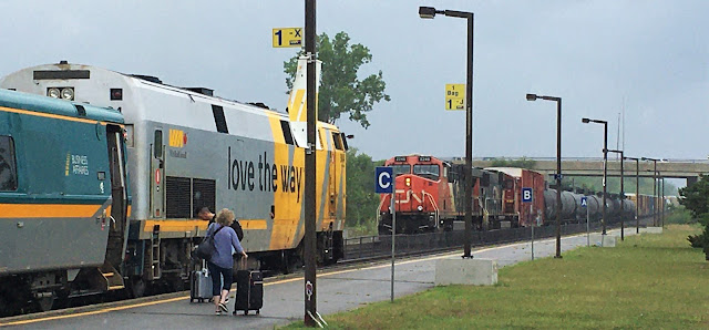
The Budd Car, also the name of his budding layout! On July 27, Derek was passing through Kingston and we had a chance to meet at the VIA station. We talked about the ins and outs of model railroading and blogging. VIA No 65 meets CN No 372 during our visit:

Also on draft day for this post, it was the first time a former or sitting U.S. president is indicted. I can't imaging the greenhouse gases generated by flying the 'perp' all the way from Florida to New York and back, with multi-car motorcades at each end. All for more methanic hot air during and after the courtroom appearance. And just before this post was finally published, about three months later, a second indictment has just dropped! How have the mighty fallen. Free summer reading from the Kingston-Frontenac Public Library Isabel Turner branch:


6 comments:
Great Tips Eric…
Thanks, Dave
Glad you enjoyed he post, Dave.
Thanks for your comment,
Eric
Excellent info Eric
Thanks, Jim. Now I'll try to follow the advice. Though my layout was made for operation, not photography, I do enjoy photography on it!
Eric
Thanks for the mention and taking the time to meet up, Eric. Looking forward to being able to use these tips in the future.
It was my pleasure, Derek. Doesn't sound that original now, but I'm also looking forward to that!
Hoping for all the best for your layout! And your blog!
Eric
Post a Comment