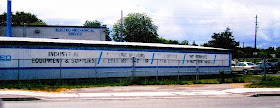
I spend a lot of time thinking like a model railroader. Flying in my HO scale imaginary helicopter (or drone!), I hover over my layout and consider what would look good, or how to complete my HO scale scenes. It would be better to think more like a sign installer. Snapping a few photos of my (now nearly two iterations ago!) Vancouver Wharves layout, I captured the industries and their signage.
Coastal Steel Construction (close to the prototype Coast Steel) was a Pikestuff kit to which I added a front office. For greater visibility from the street, and to prevent my Pikestuff structure looking like an anonymous Pikestuff structure, I printed these online-sourced signs and stuck 'em to a piece of styrene then onto the structure (above photos). Then there was Fairbanks-Morse:
Not wanting to permanently keep the F-M signage attached to this structural flat, I just glued printed signage to the exterior (above and below). On the prototype, the black lettering band would have been extended along the length of the building. But note the font! Blackand-white old-timey version:
Fonts are kind of addictive. I see why some modellers wreck their ship on the rocks of fontdom. Stencil font seemed to 'fit' for another structural flat, the Fisherman's Co-Op Federation. Another prototype industry, I shoe-horned it into a corner, primarily as a spot to receive reefers for loading:
Then a flight of font-cy! Overseas Commodities was an aisle-facing industry that received a variety of shipments in various car types. I thought the sign was still reasonable, but perhaps it was really a bit too big:
Another Vancouver-area prototype industry was Interline Forwarders. I found a logo that seemed to fit, and like the first Pikestuff example, I printed and glued to the building corners. Interestingly, this structure is paper-on-styrene! Sure hope Mr Fieri gets the BBQ shut off. Those steaks 'smell' tantalizingly delicious!
Just when my signs seemed to getting large and unrealistic, here are a few examples of what really not to do. These modellers (sorry if it's someone you know) are not thinking like sign installers. The first one shows some neat modelling, scene construction and even lighting. But why trash all that with rather awful signage. First...wrong font. Second...wrong placement. Third...looks stuck on!
Era of the building should match era of the signage. As should the level of detail. Another really neat building scene ruined by a last-minute, stuck-on sign. Hours of agonizing detail and painstaking work destroyed by minutes of easy sign installation. Too easy:
This is what not to think when adding signage to structures. Whoever made that Helvetica font available to modellers should have been treated like the low-level drug dealer who gets shut down by the cops. The Signage Police should have booked him, locked him up and thrown away the key!
Real signage in action. Near the CN underpass in Belleville was Emsco Electro-mechanical Service on Cannifton Road. Take a look at the way their services are advertised on their storage building, visible to all those passing motorists:
Unique font, unique placement, readable and absolutely realistic. (Well, it it the prototype.)
Another thing I've learned about structures and signs....get those photos now. The entire Emsco enterprise has been repurposed:
One more example. This one from East Syracuse, N.Y., right across from Wal-Mart. Painted, not pasted, to the building. A variety of fonts, sizes, colours, but all it's all marketing, and how to contact the business to learn more! Lilano!
Running extra...
The Helvetica comment above migrated to Facebook, and it started a fontflict (that's a conflict about fonts (just made that word up!)(word up!))). All because CP Rail's wordmark had some Helvetical origins. It's all about Helvetica structures, not strictures on rolling stock lettering.
This would be a good time to post some posts you'll never see posted on Trackside Treasure. Not only are they too controversial, they're like, "Hey, how deep is this well?" - when you find out, you're already in too deep. Controversial post titles:
- What year did ditchlights become mandatory in Canada?
- What was the first year ditchlights were used in Canada?
- What colour ballast should I use on my layout?
- What is the best brand of model paint to use for CN orange?
- What type of Kadee couplers should I use?


Heretical Helvetica!
ReplyDeleteOh, it is such a problem. I would rather see a hand-lettered sign on a structure. Anything other than Helvetica. Oh, the humanity!
ReplyDeleteThanks for your comment, Steve.
Eric
Never really a Helvetica fan, but at least it's better than Arial! LOL
ReplyDeleteThat seems to be a common feeling, Mark. I just hope this post gets us modellers thinking intentionally about signage especially in the prototype, since that's what we're modelling!
ReplyDeleteThanks for your comment,
Eric